

I like money
I like money
In the sense that I like the banknotes as objects and what is depicted on them

Nowadays money is becoming more and more intangible. Let’s stop for a sec and let’s take a closer look to the (few) banknotes we have in our wallet.
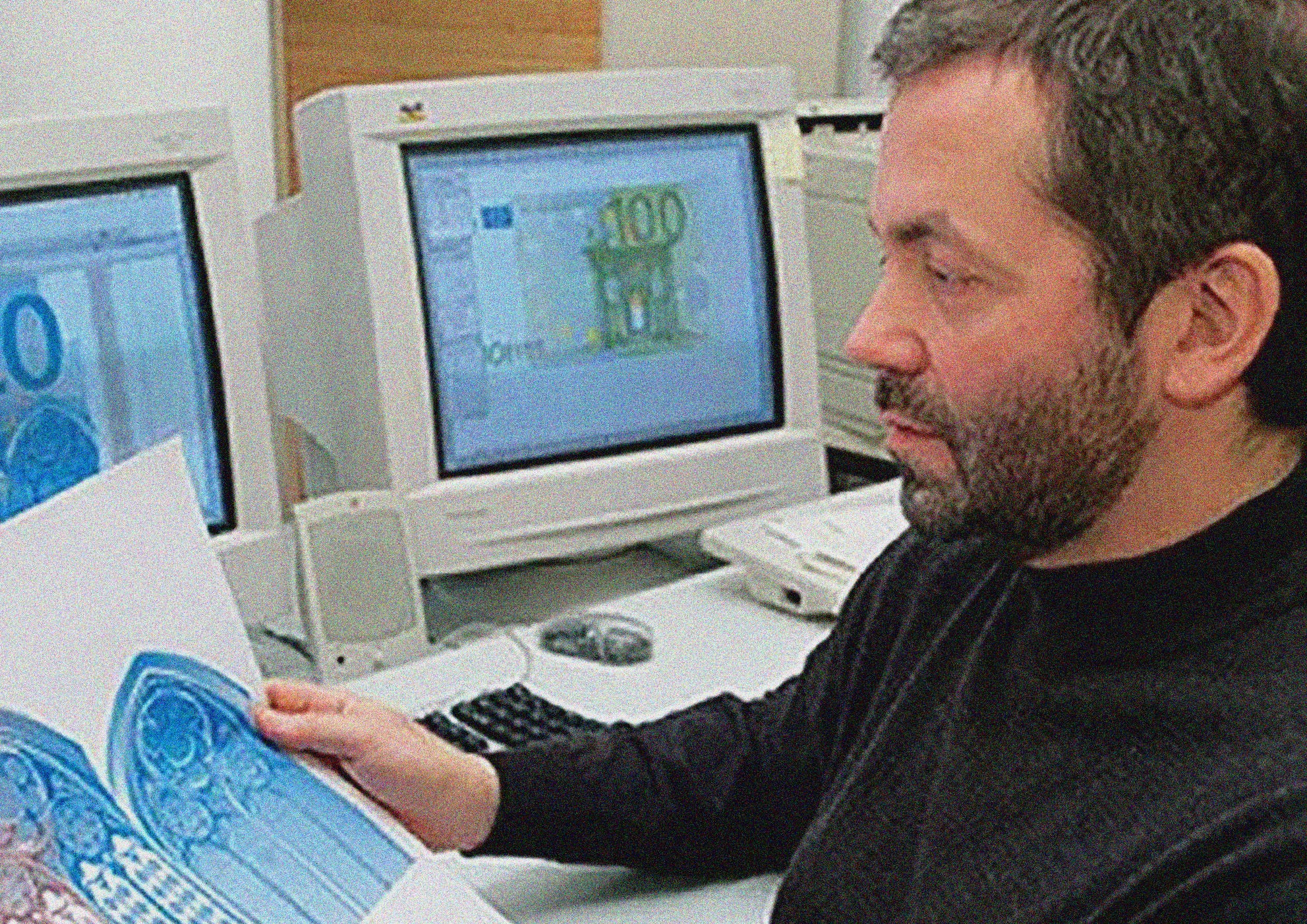
My name is Federico and welcome to Representations of Architecture #30.

Inshights
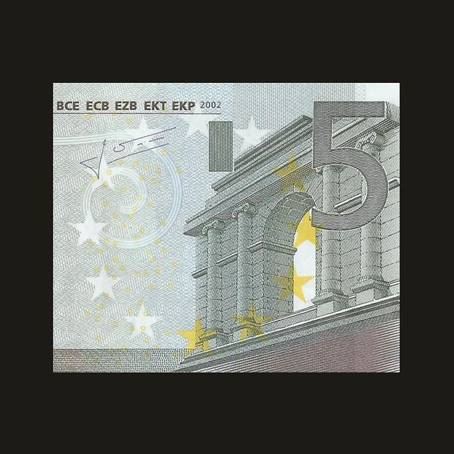
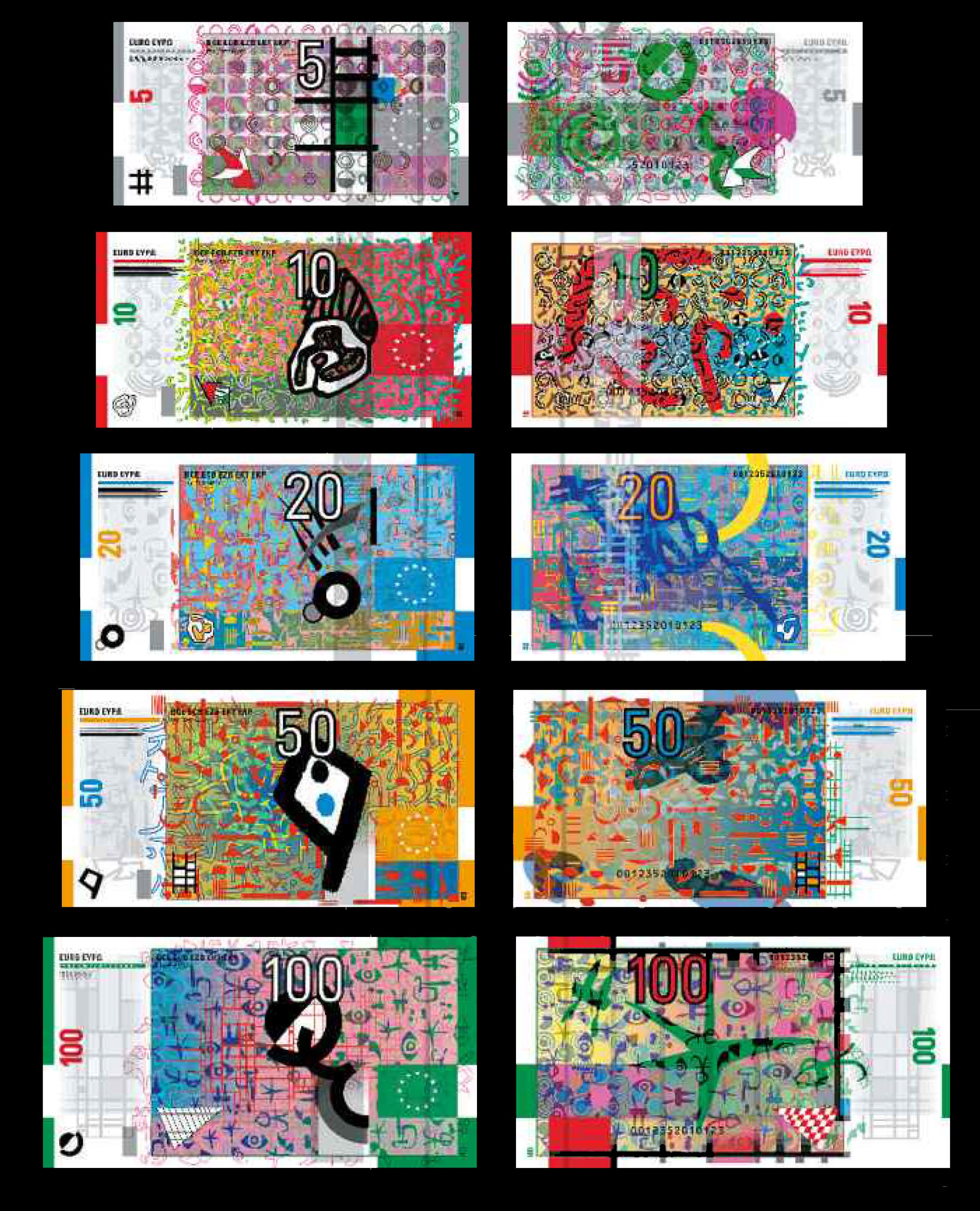
Are you able to recognize the architecture depicted on the 5 Euros Banknote? Brandeburger Tor? Not quite. Arch of Costantine? Mmh, nope. I’m sure I’ve seen it before but I can’t recall…
The reason is simple, the architectures depicted on Euro Banknotes are made-up. To avoid any favouritism ECB proposed the loose theme “Ages and Styles of Europe”. The winning design was the one by austrian designer Robert Kalina. He produced fictional representations of architectural elements that could exist in european countries but don’t quite exist.
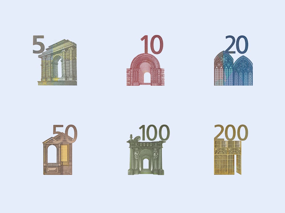
Every banknote represents the architectural style of a different period: Classical (5), Romanesque (10), Gothic (20), Renaissance (50), Baroque and Rococo (100), the age of Iron and Glass (200), and Modern 20th Century architecture (500). It’s not Europe that is represented then, but the Idea of Europe instead.
In 2010 circa, ECB thought it was time for a rebranding. The “First Series” (that’s how they call it) was gradually substituted by a revamped version of the banknotes with the original title of “Europa Series”. The brand new banknotes kept the “Ages and Styles” concept by Kalina but they were designed by Reinhold Gerstetter1. The changes are minor to almost impercetible, compare them via this sweet 3D visualizer.
From ECB website:
“The new banknotes have been modified in order to give them a fresh look and to accommodate a range of new and enhanced security features, which will also make it easy to differentiate between the two series.
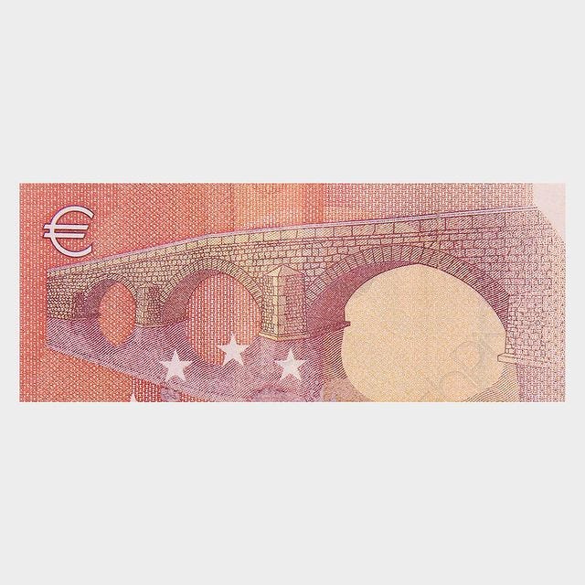
On the front of both series of euro banknotes, windows and doorways are shown. They symbolise the European spirit of openness and cooperation. The bridges on the back symbolise communication between the people of Europe and between Europe and the rest of the world.
They also killed the 500 Euros banknote (depicting modern architecture), decreeing once for all that Europe is indeed “The Old Continent”👵.

Very beautiful links
The other proposals for the competition are pretty interesting (here the full gallery) and they span from conceptual/geometric to weird pastiches like this one below.
Amazing video by water and video artist Lachlan Turczan: MONEY IS THE ONE TRUE GOD (Sound On).
Sam Jacob lucubrate on what physical money actually represents. An excerpt on the intricate design of money:
“Filigree lines loop back on themselves with almost psychotic intensity, so fine that you can zoom in and in. Images break down into patterns like fingerprints as though money wasn't something you could actually draw with a line, only suggestively sketch. Its tentative quality is a matter of anti-counterfeiting but also perhaps an expression of the immateriality of value, graphically on the verge of immateriality, a point cloud that can only approximate the thing it is trying to represent.”
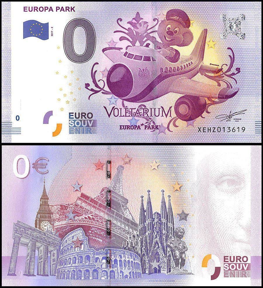
Jacob mentions also the fictional architectures represented on the Euro Banknotes, arising the topic of “using essentially faked-up historical images as the face of money” on something that should be authentic and incontrovertible. Luckly capitalism responded to this doubt with the 0 Euro banknotes.
Somehow authorized by the European Central Bank, 0 Euro banknotes are lame souvenirs depicting real european architectures and historical sites/events. But also no:
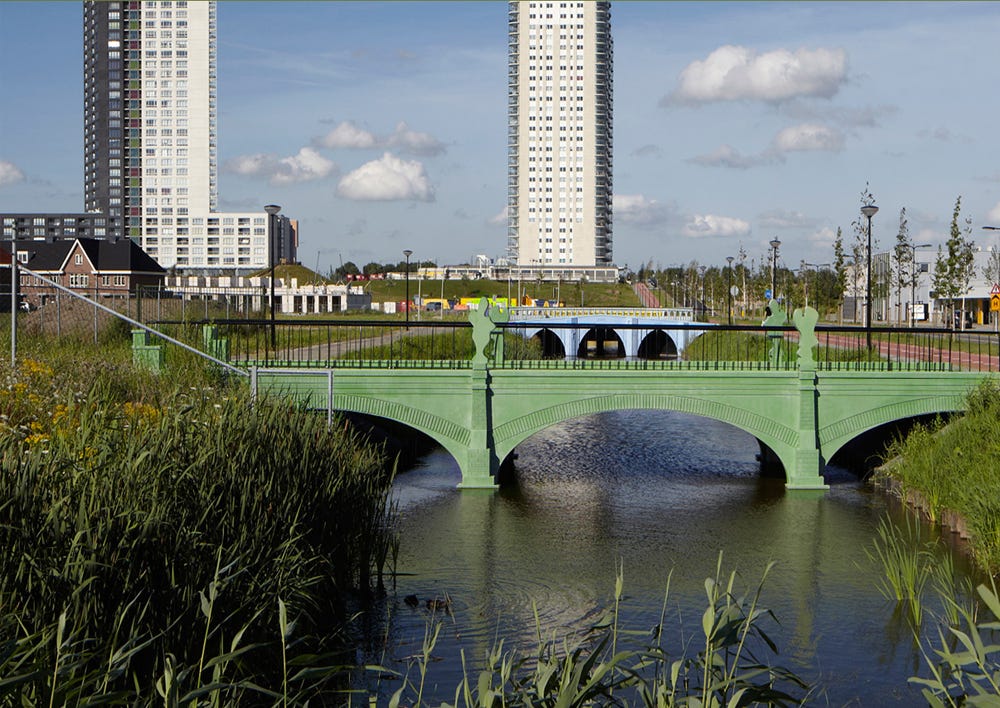
So the architectures on the Euro banknotes don’t actually exist… but what if they did? Designer Robin Stam downscaled the bridges depicted on the back of the banknotes and made them real in an housing complex in Spijkenisse (near Rotterdam).
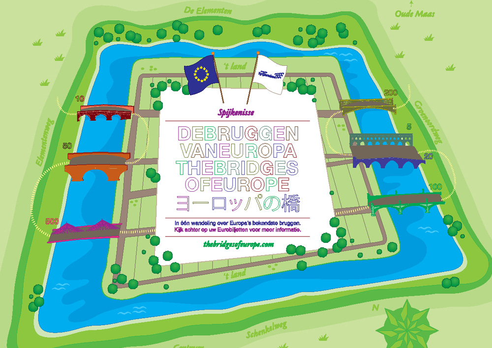
All of the 7 bridges from the banknotes become colorful pedestrian bridges. Such an incredible idea… They were built in 2015, but why no one thought about it before? Watching the photos of them feels weird: it’s like seeing the live-action version of an anime or a cartoon.
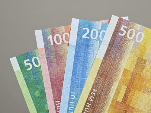
Norwegian architecture and design firm Snøhetta designed the new banknotes for the Norges Bank. They are utterly beautiful.

Sweet IG pages
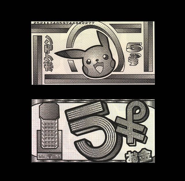
Gram Publishing is an italian indipendent publisher. A couple of years ago they invited some graphic designers, artists and illustrators to design fictional money. Scroll through their page to discover some crazy designs. You can also purchase practical packs of banknotes on their website. In the design above: a smiling pikachu and what seems to be the Lavender Tower.
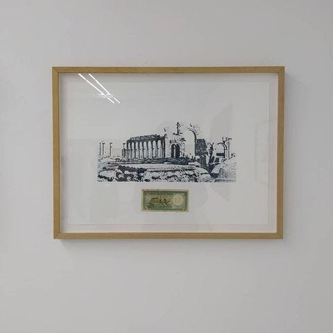
This artist was tipped me by a friend. His name is Ryts Monet and his research often involves money. In his project Schuld (2019) he produced a series of photogravures of architectures extracted from banknotes of different countries. The ruins depicted unveil a surprising connection between mediterranean countries:
“Antiquity becomes a metaphor for a past era in which the political-cultural unity of the Mediterranean was defined by the conquering ambitions of the Roman Empire.”

Misc
That’s it for this week! This mail was scheduled so in this exact moment I’m probably skiing ⛷️.
See you next week with a suburban takeover!
Take care and wear the helmet,
CIAO
Federico
Who partecipated to the competition in 1997 but didn’t manage to won.