
A bunch of boxes
and other amenities

My name is Federico and welcome to Representations of Architecture #2.
In the first mail that I sent last saturday I explained the structure of the newsletter. In case you missed it you can take a look here.
Let’s start!
Insights
This week I published just a couple of drawings on analog, both from the same author: Renè Bosshard.
Who is Renè Bosshard? He is an architect currently working in Switzerland at Mass Werk. But we don’t care, we care about these beautifully crafted drawings:
They date back to 1989, when Bosshard was a student at ETH Zürich. He attended the design studio held by Miroslav Šik, a czech architect theorizing something called Analogue Architecture. At the end of the course every student had to draw their project in beautiful prespectives with a soft morning light. They did exhibitions and books. Šik, still a teacher at ETH, pursued Analogue Architecture in his design studios until 1998. You can browse all the fantastic drawings by his students at this link.
All these images share a mood, they have a coherence. Analogue Architecture is something that Adam Caruso (from Caruso St. John) can explain you in a better way. At this link you can find a complete article previously published in AA Files.
Very beautiful links
I’m working on a paper about a project by Mario Ridolfi on Via dei Fori Imperiali. Searching for old photos I found this one: Fascists marching on Via dei Fori Imperiali in Rome. That’s bad. This is nice instead.
This turist trap is also a great spot for committing suicide.
Do you want to see one of your creations on the cover of Log? Check this competition: https://www.anycorp.com/log-51-postcard-competition
Virgil Aboh is doing crazy stuff blending Mies’ Barcelona Pavilion, Post-Modernism and The Dark Knight’s Garage:
They finally found Satoshi! Incredible story.
I’m currently moving my first steps in VR, with an already obsolete Oculus Quest. There are a bunch of interesting softwares to draw and model in VR, one of them is Quill. It is possible also to do some animations. Regular ones but also something like this: Watch a bird made of ships and buildings.
Italian architect and former editor of Domus Michele De Lucchi designed (together with illustrator Andreas Rocha) the covers of Harry Potter’s new italian edition. If you speak italian read this article, otherwise just take a look at the drawings on Rocha’s instagram. I’m not a big HP fan, but these covers look just great. This collaboration sets a really good example of interdisciplinarity. I remember architecture drawings being used as book covers, but in this case it has been done a step forward.
This book is definitely on my wishlist. It is quite expensive but a book by Studio Lin is probably worth the money it costs. I’ll try to find an used copy. Where do you buy your second-hand books? Usually abebooks is the perfect platform. Do you have any tips?
Sweet IG pages
A couple of months ago I discovered this beautiful and delicious page:
Piccoli Posti means Small Places. In these tiny drawings there is the demonstration that sometimes to depict a space (and a mood) what we need are just 2 colors and the right number of well-thought strokes.
Last week Aldo Rossi’s daughter. This week Ettore Sottsass’ wife.
Barbara Radice Sottsass started to share some of his husband’s projects.
Smash follow right now!
Misc
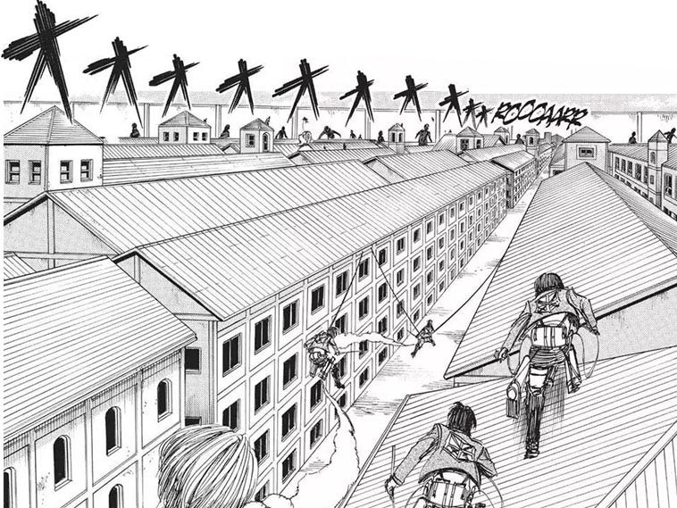
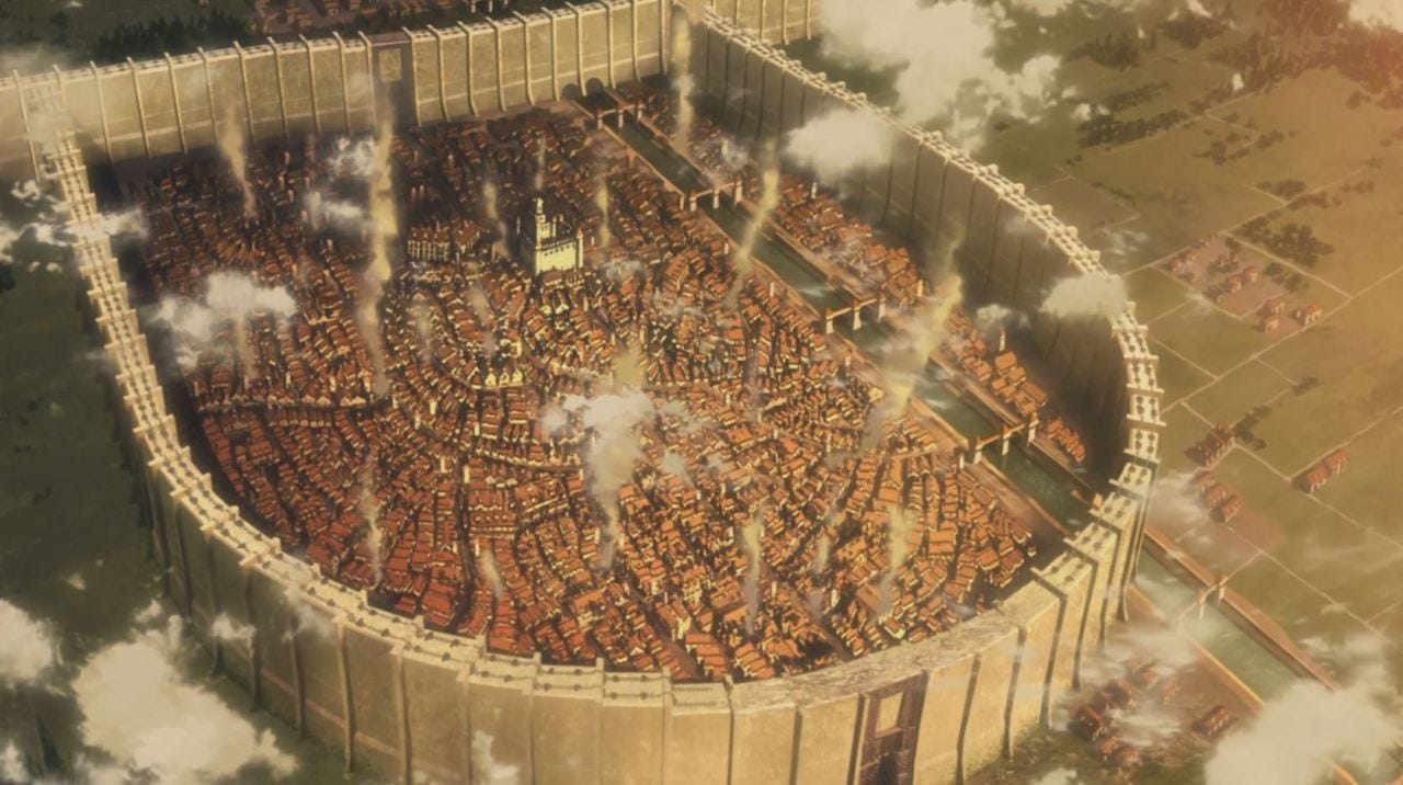
We can finally talk about the image on top. It is taken from the best-selling manga called Attack on Titan by Hajime Isayama. It started in 2009 and it will be over during 2021. It’s the story of a walled city constantly attacked by people-eating giants. The giants don’t talk and are fast and strong. No one knows where they come from and people live in constant fear. That’s just the premise: a carousel of revelations and cliff-hangers make it an entertaining product.
I started reading it but I dropped it after 10 volumes. The story was wrapping on itself, but mostly the drawings were just something hurting my corneas. I couldn’t stand them anymore. They were just awful.
Plus, the architecture didn’t make any sense at all.

It was just a bunch of boxes, poorely drawn, with different styles ranging from austrian Siedlungs to germanic or british architecture, with a wink to Metafisica.
The manga had (and continues to have) a great success, and how it happens with all best-selling mangas it was transposed into an anime. Luckly I’d say. Because they did an amazing job: great animations, beautiful drawings, and a narration rhythm that patches all the flaws of the manga.
This abandoned tumblr page was collecting some stills from famous animes, and Attack on Titan is among them. Take a look here.
My suggestion is to start watching directly the anime. It is enjoyable, especially if you like mysteries, action, suspance and violence. There are some scenes where japanese humor could be a bit too much for an anime amateur, but I think it’s bearable.
Season 4 is now airing, and unfortunately the animation seems to have gotten worse compared to the last season. That’s a pity.
#2 is over. Next week we’ll see a different kind of boxes.
I’ll leave you with a thought by Arata Isozaki from an interview that I was reading the other day:
There is something hidden in architecture, and you have to discover it. An architect must have the curiosity to know as many things as possible, even those that seem superficial or those that go beyond architecture. An Architect must constantly search for unusual things, something extraordinary, something better than others… It is fundamental to search always for something like this. The rest is possible to learn it with the practice."
Ci vediamo sabato prossimo!
Bye
Federico
P.S. I renew my: “Please tell a few friends about the newsletter if you feel like it.”