


Takeover #16 - Laura Simonati
Piccoli Posti

It’s saturday morning. Hopefully you are currently lazing around in your house. Eventually today you are going to see some small beautiful places. Probably in this newsletter.
Only for the Takeovers my text will be in italic, just to distinguish it from the guest’s. My name is Federico and welcome to Representations of Architecture #42.
Intro
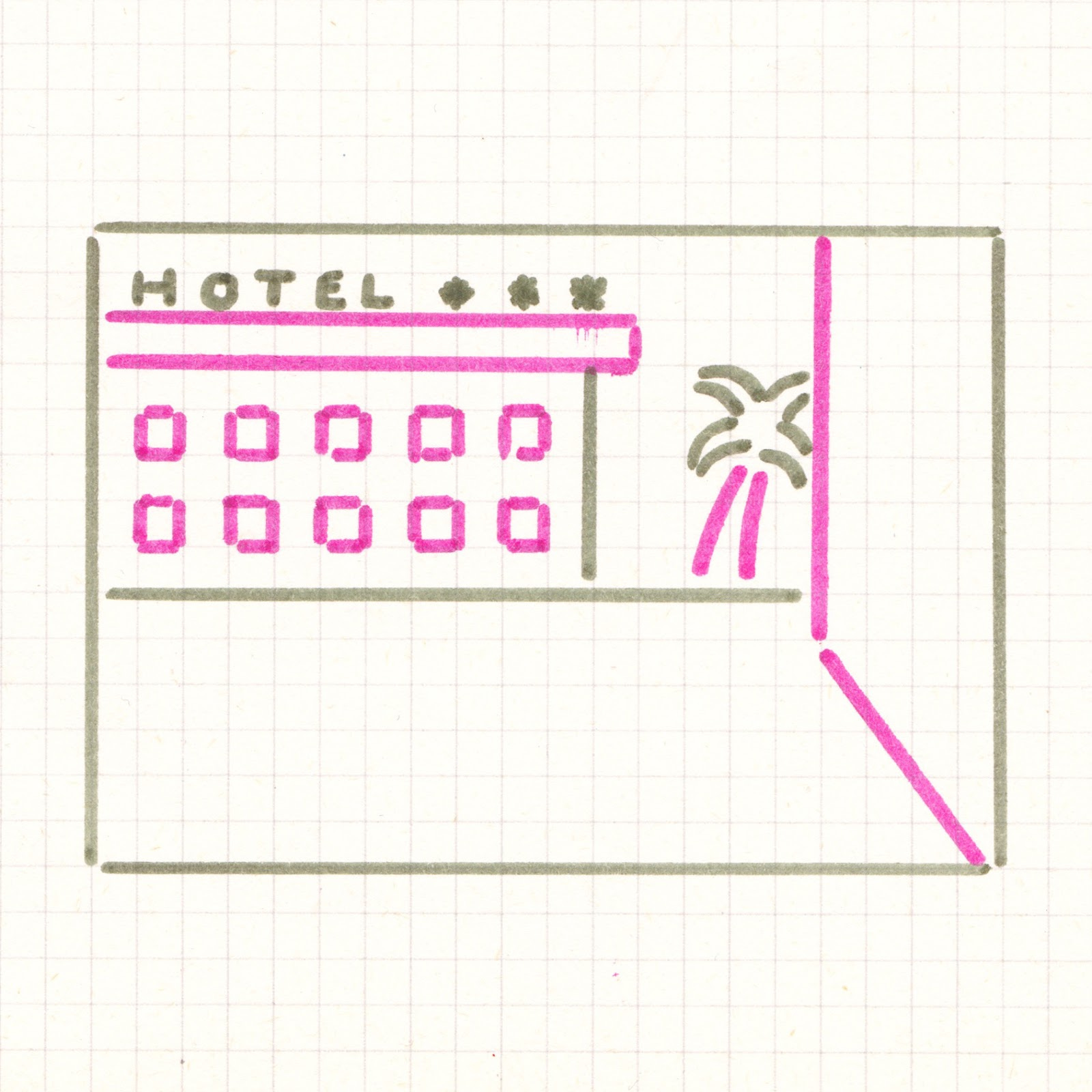
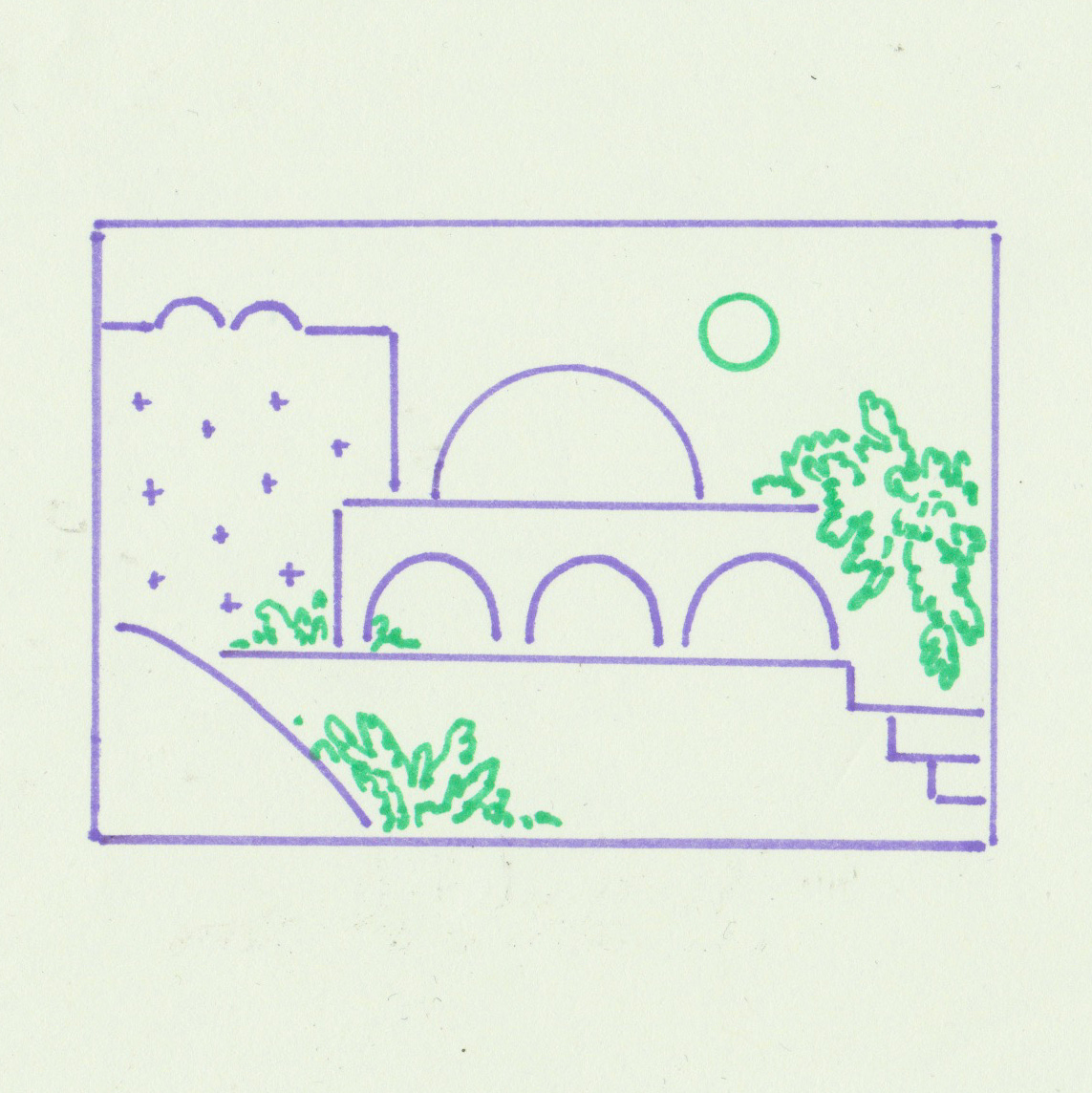
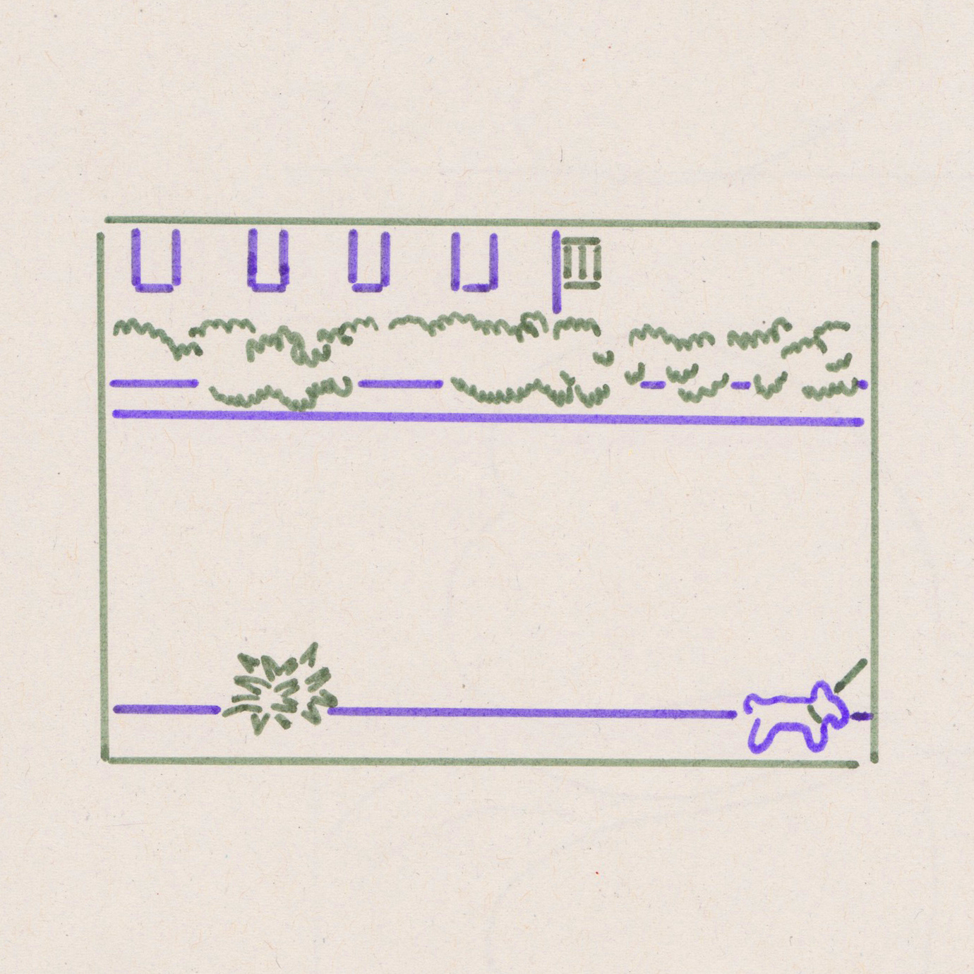
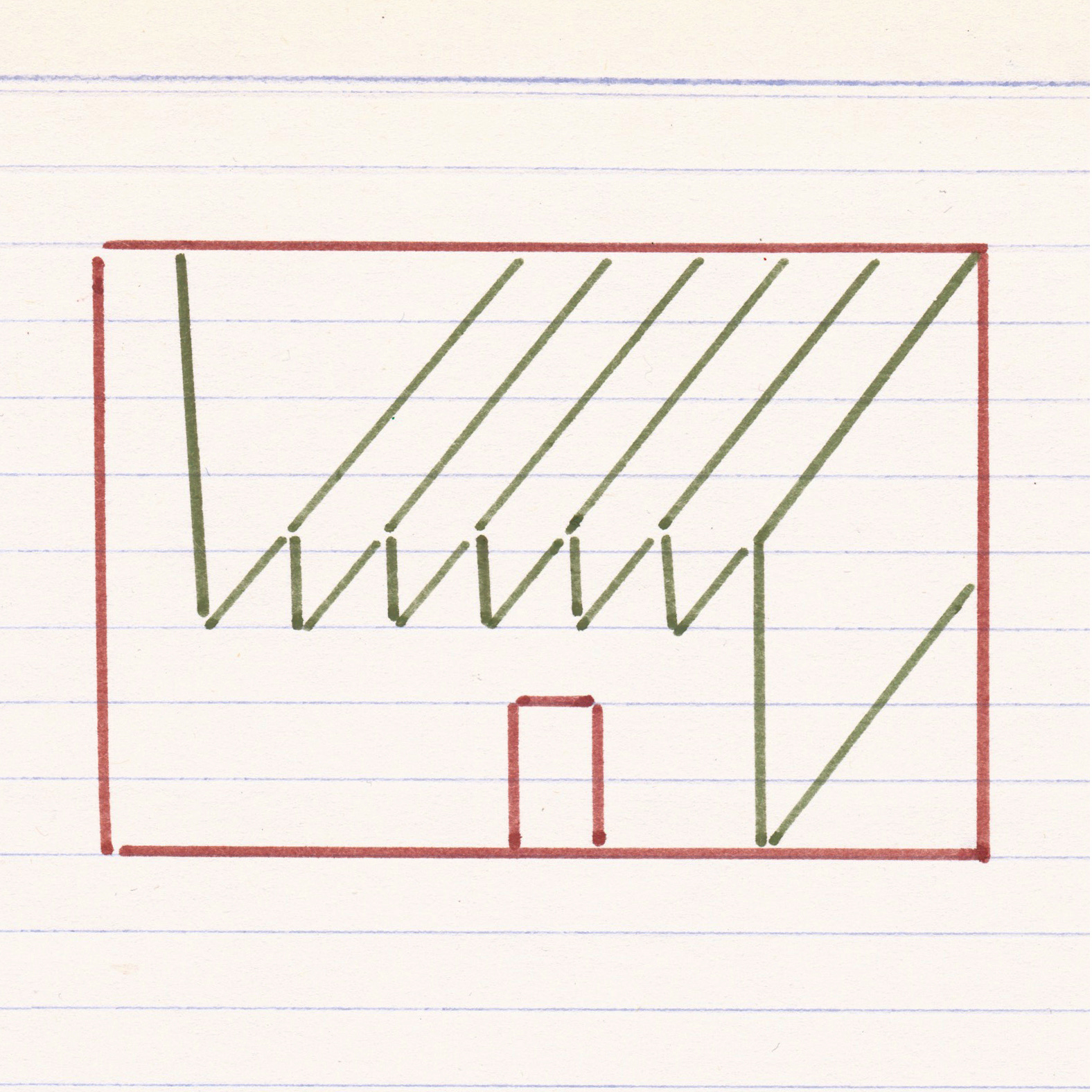
How many lines do we need to describe a place and its mood? How many colors? How many fixed directions? Laura’s work proves us that the answer is: few. Her strokes are surgical. Not one more and not one less than necessary. Grainy felt-tip colors find their way on exercise book paper. Lines and squares that on the other side of the paper probably host some notes. Notes not related in any way to the places drawn on the front. The places are like flashes remembered from a distant summer. A stop at the gas station, an old warehouse in the countryside, a dull suburban architecture, an unknown woman walking her dog. They describe, in a small scale, some italian nostalgia that you can totally get only if you experienced it firsthand.
Exactly two years ago Laura started Piccoli Posti. Today she’ll give us some sweet insights on her work and process.

Insights
Piccoli Posti is a series of very small drawings started in June 2020.
Like many projects, this series started quite randomly: I was stuck in between two projects I didn’t like: one in a studio where I worked as part-time employee and a school project.
I was looking for a form of creative relief from the studio and school projects and I found myself drawing little sketches about imaginary scenarios, that few weeks after became the Piccoli Posti, which literally means “small places”.
I initially started this series by drawing one sketch per day, playing with them as a sort of composition exercise.
Each Piccolo Posto measures 5,5x8cm, it’s only made with outlines in two colours on scrap paper. To draw them , I normally use the cheapest fine tip markers I found around me.
In order to be a sustainable daily “amusement”, Piccoli Posti needed to be fast to do, cheap to produce and easy to stock.
When I started posting them on Instagram and getting a little affectionate community following them, I realised that they were actually a naive expression of personal and collective imageries, rather than simple compositions of forms and colours.
This aspect is probably the best one of the project: getting aware that people can project themselves into your works more that how you actually do.

Talking about the drawings, I guess that the subjects I mostly like to explore are those linked to the everyday life and aesthetic decadence of the Italian suburbs and those linked to clichés.

Important sources of inspirations are for sure the work of Luigi Ghirri and the visual experimentations of Paul Cox and Philippe Weisbecker.

Very beautiful links
If you’re looking for an eclectic soundtrack for your afternoons:
Radiooooo

Sweet IG pages
Beautiful books:

Beautiful images:

Beautiful things:

Beautiful places:


Misc
Well, it’s summer!
To start the season I recommend you watching a beautiful documentary by Belgian director Agnès Varda , “Du cote de la Côte”, made in 1958 and commissioned by the “Office de tourisme Français”.
A 24 minutes film about the French Riviera, full of colors, juxtapositions, poetic verses and humour.
I definitely wish to take a walk on the french riviera right now. Maybe sipping some fresh OJ while doing nothing.
But unfortunately I’m currently sweating in my 20 sqm house 🥵.
With this great image in your mind I take the occasion to thank Laura for her time and her precious insights.
See you soon my fellas,
CIAO
Federico