No time to explain! This newsletter starts NOW!
Only for the Takeovers my text will be in italic, just to distinguish it from the guest’s. My name is Federico and welcome to Representations of Architecture #17.
Intro
Take Peter Eisenman, Luigi Serafini’s Codex, Yuichi Yokoyama, a bunch of sandwich-related reddits, some philosophy and a simple and delicious italian sandwich called Tramezzino, blend all together with a Blendtec blender and what you’ll obtain is “La Tecnica del Tramezzino (The Sandwich Guide), a Georomantic Essay through the Uncandy Ethereal”. It’s a self-published treatise by SerT that is probably the nightmare of every librarian: it’s impossible to categorize. Through intricate texts and kinetic drawings SerT eviscerates the theme of the sandwich in the broadest sense possible, dipping the feet in the cold water of architecture, but also with a wink to comics and lost/forbidden cooking manuals. He is here today, only for you dear subscribers.
Website: https://sertcomics.tumblr.com/
Instagram: https://www.instagram.com/togniser.sip/
Facebook: https://www.facebook.com/sertcomics/
Insights
Hi everyone, my name is Stefano (but you can call me Ser) and one of my main interests is comics language: I’m not properly a cartoonist, because my job more often revolves around big paper formats, architectural drawings and service design (and probably that’s why I’m here - or that’s for my work on comics indeed?). However, I think there’s some similarity between the kind of architecture and comics that I’m more interested in. I will talk about it using some interesting stuff throughout this mail, but let’s start with my drawings.
I think that my taste in comics in recent years has particularly focused on the relation that the content of the message, the actions and the characters have with the narrative structure that surrounds them. In a certain sense, this role has been covered by the frames in comics and, similarly, by partitions, typologies and other design tools in architecture.
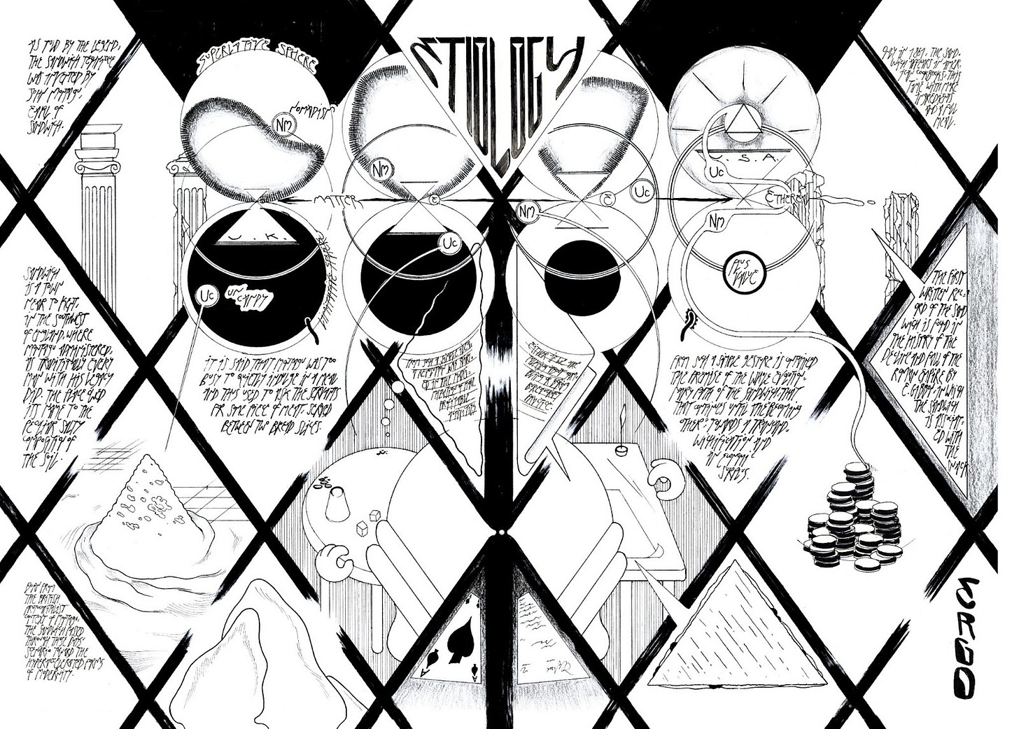
Take this page from my last self-published book, The Sandwich Guide: a Georomantic Essay through the Uncandy Ethereal. The thick black lines frame the space of the page and sometimes even leave the vignettes connected, as an open door does in a floor horizontal section. Even the balloons in the upper part of the spread plays more with the spatial logic than the verbal, traditional one: in each of the couple of globes the words don't change in fact its content, rather than their spatial coordinates. Indeed, here the sequentiality revolves around the shift of the distances of the balloons from themselves more than the change of the content of the balloon in time. Practically I inverted the role of balloons and characters in comics to underline the fundamental elements of time, space and logic of comics language.
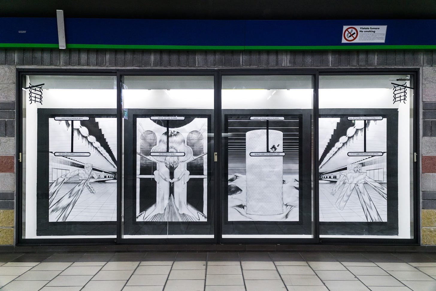
NOW we are running in a long infrastructural corridor behind Porta Garibaldi Station in Milan. An ominous avatar will guide us through the Californian desert of a town namedZZYZX (you can read about it even in some writings by our beloved Reyner Banham), to a Zoroastrian Tower of Silence for sky burial set in Yazd, Iran, and then back in Milan.
This is kinda the point in my site-specific intervention for the in_festa exhibition curated by co_atto, which investigates themes like transition, journey, decadence and illness.
It’s not that common for comics to take these huge sizes or to confront so directly with public spaces, so I wanted to strongly characterize this work and pay homage to the classic 4-panel comics strip, here summoned by the partition of the display. Also the composition is designed to fit the perspective distortion caused by the depth of the niche, and there are different ways and modalities in which the strip could be read: the one of the overall structure and composition that communicates immediately with the hurry passenger and, then, a more subtle content for those who choose to spend some minutes in the reading.
Very beautiful links
So my work is very imbued with this sense of the structure in which messages and characters are displayed in. I find really much affinity with the research in semiotics by typedesigner and teacher Luciano Perondi and with the concept of Synsemia.
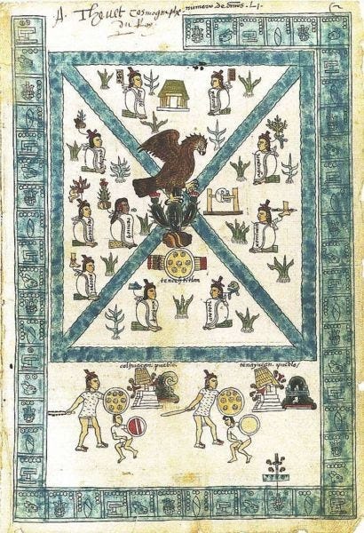
Synsemia “[…] is defined as deliberately and consciously placing elements of written language in space, in order to communicate, through space articulation, regularly and in a reasonably unambiguous way”. This really much resonates with my fetish for Ancient narrative and writing forms. Take the Codex Mendoza here, written in the Aztec language: the position of the figures doesn't actually display their configuration in space, instead is a direct signifier of a concept, like a sequence of letters in a line.
You can clearly imagine how this spatialized narration has consequences in comics or even in architectural representation, since both are stages for actors to perform and network. To deepen this theme, you can watch this clear lesson by Perondi about the Codex Mendoza or, if you master Italian, you can listen to his supernice podcast Radio Babbel.
In times of smart working, also ergonomics are a tough rigid structure that sometimes cuts our body half with pain.

Please pay attention to your workstation, fasten your seatbelt and don't forget that ergonomics is not a static science.
Speaking of comics, I would like to introduce you to this amazing collection of scanned abstract and conceptual comics made on Monoskop portal by Ilan Manouach, one of the best representatives of this school. You will also find that many of these books deal with architectural studies and representation, like in Ting Chak’s Undocumented: The Architecture of Migrant Detention, a forensicarchitecture-like report on the strong bond between militarisation, surveillance and space typologies or in Graham and Eisenhower’s Scaffold, where the reader follows the facades of some weird building construction site structures. Have a nice reading!
Sweet IG pages
There are not really many collectives and artists involved both in comics production and in furniture, exhibition and architectural design. One great name is the Belgian Super-structure, a collective powered by Francois de Jonge and Sukrii Kural.
Seems like Enzo Mari’s self design and underground self-publishing married together.
Take the fluo signs made by public street plumbing teams and the peculiar atmosphere that you can breath in a construction site (something you might be familiar with). Create an original aesthetic from that, mixing writing, tags and 3d modeling. The result will be Graffiti Repairs, a superfresh page of street photos and original artworks.
The owner of the page also created a free-to-use png sticker pack, which could add some street cred to your project.
The coolest kid in town, Luigi Cippini's Armature Globale is an architectural design firm with one of the most original voices you can find around here. Check their projects in exhibition design, cinemas and hi-tech bulletproof villas.
Misc
Sometimes the boxes we live in are very useful. Sometimes we can get really annoyed by them. The anarchic intellectual David Graeber, in his really great book The Utopia of Rules: On Technology, Stupidity, and the Secret Joys of Bureaucracy, described how bureaucracy can reserve some unexpected pleasure for life (with moderation).
I think it’s precisely the sensation that the videogame Return of the Obra Dinn makes me feel. It’s a kind of unique game, an insurance inspector simulation game, in which you have to recreate the scene of the crimes staged in a victorian ship and identify the name, the job and the death of each of its 60 passengers. Absolutely recommended.
Hope you enjoyed my links and my suggestions, see you again soon!
Such an incredible journey. Thanks SerT, this was intense.
My final tip is: grab a copy of the Sandwich Guide while you can, I understood there are just a few copies left (All the links at the beginning of the nsl).
See you next week fellas, enjoy your weekend.
Cià!
Federico


